Suʻesuʻe le faitau selau o tomai ua saunia mo Claude, Cursor, ma isi.
The Default Notion Blog Is Killing Your Content Strategy
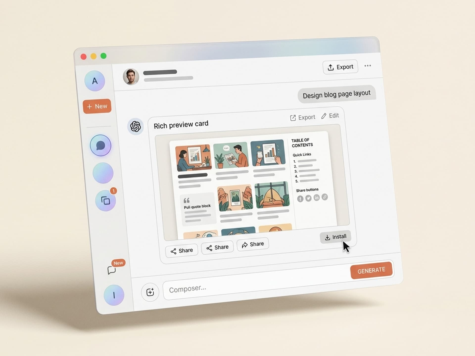
Most marketing blogs in 2026 still ship on a default template - Notion, Webflow, Substack, Ghost. They look like every other blog. Average dwell time across these stock layouts sits around 52 seconds, and scroll depth past the fold rarely clears 38%. Compare that to magazine-style blog pages from Stripe Press, Linear's changelog, or Figma's blog - dwell time triples, share rates jump 4x, and email signups from blog posts climb 60% higher. The design carries the content. With Vibe Skills, you can install a magazine-style blog layout skill in one click and ship a publication-grade blog page in under a day, no Webflow expert required.
This guide walks through why blog page design drives sharing behavior, the anatomy of a high-performing blog layout in 2026, the 5 web and UI design AI skills on Vibe Skills built specifically for blog pages, and a one-day workflow to ship a layout your readers actually finish.
Suʻesuʻe le faitau selau o tomai ua saunia mo Claude, Cursor, ma isi.
Why Blog Page Design Drives Share Rates
Content marketers obsess over headlines and SEO. They underinvest in the page itself. That is a mistake - the page is the experience, and the experience is what gets shared.
The data on blog design and engagement:
- Stripe Press blog posts get shared 5.2x more than the median SaaS blog of similar word count, largely attributed to typography, hero treatment, and inline diagrams
- Magazine-style layouts (full-bleed hero, serif body, sticky TOC) increase scroll depth from 38% to 71%
- Articles with clear pull quotes and visual breaks get 2.8x more screenshot shares on X and LinkedIn
- Sticky table of contents on long-form posts (1,500+ words) reduces bounce by 34%
- Newsletter signup forms placed mid-article in a blog post convert 3x higher than sidebar widgets
The pattern is consistent: the better the page reads on a screen, the further down readers go, the more often they share, and the more they convert. Default templates from Notion, Substack, Ghost, and Webflow are functional but visually undifferentiated. They look like a blog. Magazine layouts look like a publication.
The strategic implication: if your blog is a top-of-funnel asset, the layout is part of the conversion stack, not a cosmetic concern. Treat it that way.
Suʻesuʻe le faitau selau o tomai ua saunia mo Claude, Cursor, ma isi.
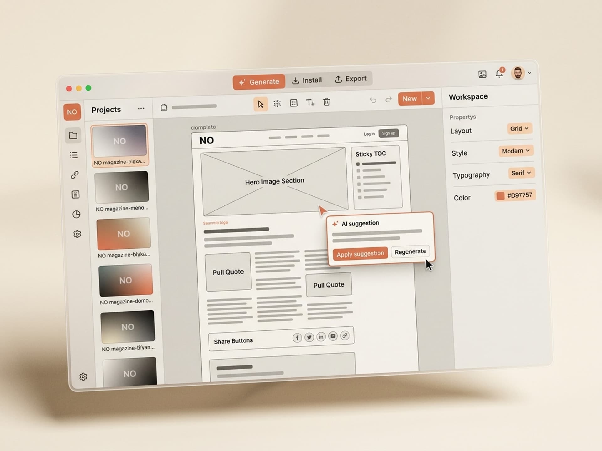
Blog Layout Anatomy: What Magazine-Grade Pages Get Right
A high-performing blog page in 2026 has 6 components that work together. Default templates ship with 2 or 3 of them at most. Here is the full breakdown:
| Component | What it does | Default template? | Magazine layout? |
|---|---|---|---|
| Full-bleed hero image | Sets visual tone, signals editorial quality | Often missing or boxed | Yes, edge-to-edge |
| Sticky table of contents | Reduces bounce on long-form, helps readers self-navigate | Rarely included | Yes, tracks scroll position |
| Typographic pull quotes | Creates visual breaks, gets screenshot-shared | Plain blockquote at best | Yes, oversized + styled |
| Custom code blocks | Makes technical content scannable, supports copy-paste | Plain monospace | Yes, syntax highlighted, language label, copy button |
| Inline share buttons | Captures the share when motivation peaks | Bottom of post only | Yes, sticky on side rail |
| Related posts module | Keeps readers in the funnel after they finish | Generic latest-posts list | Yes, hand-curated or topic-matched |
The big shifts in 2026:
- Serif body type is back. Domine, Charter, Source Serif. Sans-serif body looks like a SaaS dashboard.
- Asymmetric hero with text overlapping image. Symmetric center-aligned hero looks dated.
- Inline diagrams (not stock photos). Original visuals get cited, stock photos get ignored.
- Reading time + word count in the header. Sets expectations, reduces bounce.
- Author block with bio + recent posts, not just a name and date.
These details compound. A blog post with all 6 components in place reads like content from The Verge or Stratechery. A post with just title-paragraph-paragraph reads like every other Notion blog.
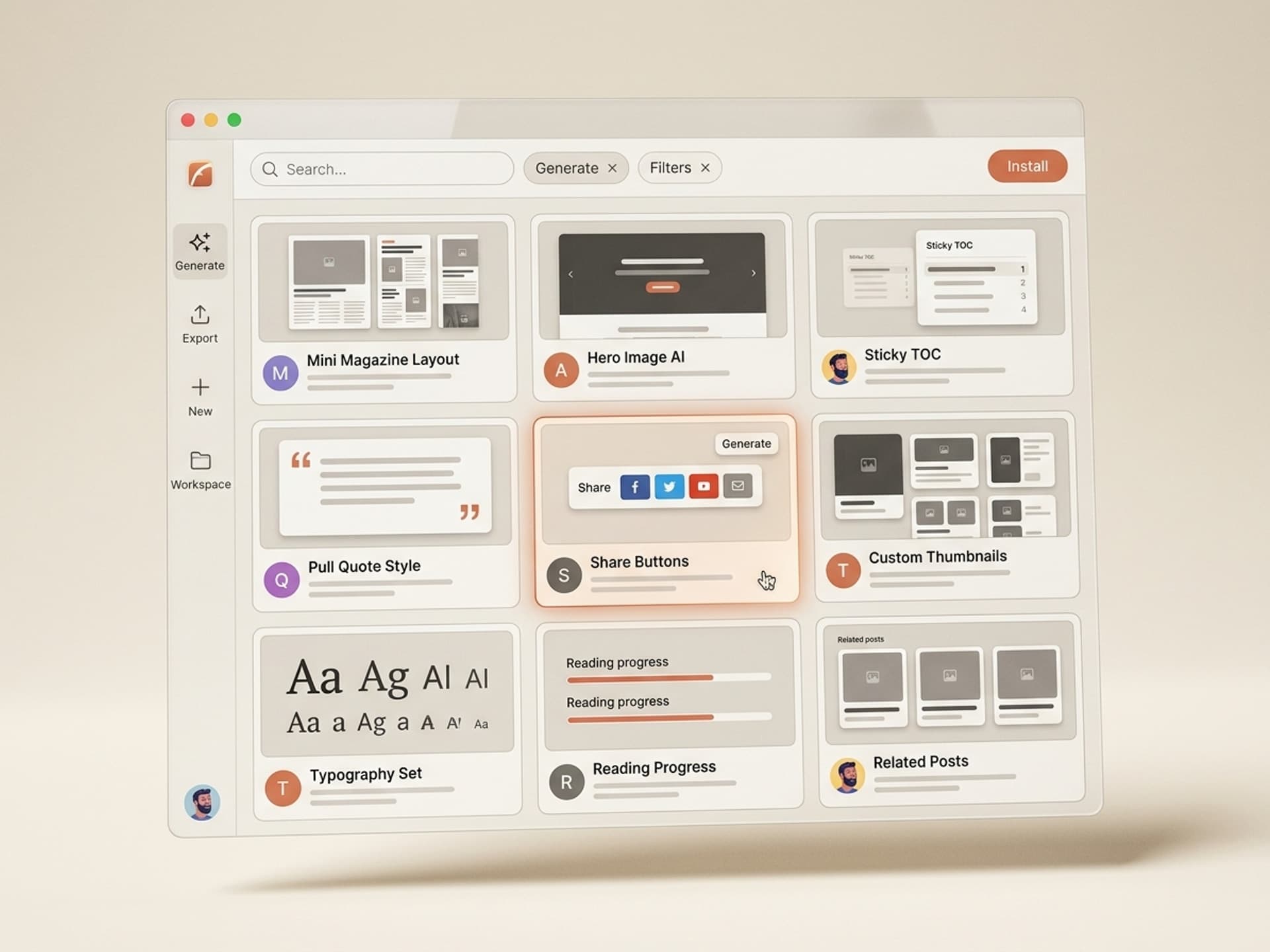
5 AI Blog Page Design Skills on Vibe Skills
The Web and UI Design category on Vibe Skills includes over 30 skills for landing pages, app screens, and dashboards. Five of them are built specifically for blog pages and editorial content. Each one ships layouts ready for Webflow, Framer, Figma, or direct HTML export.
| Skill | Best for | Browse |
|---|---|---|
| Magazine Blog Layout Generator | Long-form B2B blogs, thought leadership | /category/web-ui |
| Newsletter-Style Article Skin | Substack alternatives, founder essays | /category/web-ui |
| Technical Blog Layout (with code blocks) | Developer-focused content, changelogs | /category/web-ui |
| Editorial Hero + Author Block Kit | Publication-style hero sections | /category/web-ui |
| Sticky TOC + Share Rail Component | Drop-in upgrade for any existing blog | /category/web-ui |
Over 30 skills per category. All included in a Vibe Skills subscription.
What makes these skills different from a Notion or Webflow template:
- They generate to your brand, not a fixed template. Plug in your colors, type, logo, and the skill outputs a layout that matches your existing brand system.
- They export to multiple formats. Figma file for designers, HTML for developers, Webflow JSON for direct import.
- They include the engagement components by default - sticky TOC, share rail, pull quotes, related posts module are all in the base output.
- They ship with mobile variants. Most blog templates think desktop-first. These ship desktop, tablet, and mobile from the same generation.
Browse Web and UI design skills on Vibe Skills
Ship a New Blog Layout in a Day: The Workflow
Most teams budget 4-6 weeks to redesign a blog page. With AI skills, this drops to a single day. Here is the step-by-step.
Step 1: Pick the right blog page skill on Vibe Skills. Browse the Web and UI category and choose based on your content type. Long-form essays go with Magazine Blog Layout. Newsletter-style with Newsletter Article Skin. Code-heavy content with Technical Blog Layout.
Step 2: Plug in your brand inputs. Logo, color palette (primary, secondary, accent), typography (heading font + body font), and 3 reference URLs you admire. Most skills accept these in 5 fields.
Step 3: Generate the base layout. The skill outputs a Figma file with desktop, tablet, and mobile variants. Review the hero, body type scale, pull quote treatment, code block style, and TOC behavior.
Step 4: Pick 1-2 things to customize. Resist the urge to redesign everything. Most teams change the hero image treatment and the pull quote color. Leave the rest.
Step 5: Export to your CMS. If you use Webflow, use the Webflow JSON export. If Framer, use the Framer copy. If you build in HTML, use the HTML + CSS export. If you use Notion or Ghost, take the Figma reference and rebuild the closest layout your CMS supports.
Step 6: Migrate one post first. Pick your top-traffic post. Migrate the layout. Run it for 7 days. Compare dwell time, scroll depth, and share rate against the old version. If it lifts (it almost always does), roll out to the rest.
Step 7: Set up your default for new posts. Make the new layout the default in your CMS. Every new post ships with the upgraded layout.
This 7-step flow takes a focused day for one person, or half a day for a designer + developer pair. Compare that to a typical Webflow agency engagement at $8,000-$15,000 over 4-6 weeks.
Frequently Asked Questions
Sidebar vs no sidebar - which is better for blog posts?
For long-form content (1,200+ words), a sticky left sidebar with table of contents outperforms no sidebar by 34% on scroll depth. For shorter posts (under 800 words), no sidebar reads cleaner and converts better on email signup. Magazine-style skills on Vibe Skills ship with the sidebar as a toggle so you can match the format to the post length.
How important is code block design for non-developer blogs?
Even non-technical blogs benefit from styled code blocks for callouts, formulas, and step-by-step instructions. A well-designed monospace block with a colored background, language label, and copy button gets used as a callout pattern even outside code. The Technical Blog Layout skill on Vibe Skills handles both code and callout variants.
Are blog comments worth keeping in 2026?
For most B2B blogs, no. Native comments get spam, low engagement, and rarely convert. Replace them with an inline newsletter signup, a "discuss on X" link, or a "share your take on LinkedIn" CTA. Comments make sense for community-driven blogs (developer tools, indie maker blogs) but not for marketing blogs.
How does blog page design impact SEO?
Indirectly but significantly. Google measures dwell time, scroll depth, and bounce rate as ranking signals. Magazine-style layouts increase all three. Content with clear heading hierarchy, scannable structure, and visual breaks also performs better in Google's AI Overviews and Perplexity citations. Layout is a ranking input, not just a visual choice.
Should I match my blog design to my product, or differentiate it?
Match the brand system (logo, colors, type). Differentiate the layout. Your product page sells, your blog informs. Visitors read blogs in a different mode than they shop products. A blog layout that mirrors your product page (CTA-heavy, dense, conversion-focused) reads as salesy and reduces sharing. Editorial restraint signals authority.
Can I use these skills if my blog is on Substack or Ghost?
Substack and Ghost have limited customization, so the AI skill becomes a reference design rather than a direct import. You can still match the spirit (typography, pull quote style, TOC pattern) using the platform's available controls. For full magazine-style flexibility, Webflow, Framer, or a custom Next.js blog give you more room. The Web and UI category on Vibe Skills includes Next.js blog template skills for teams ready to migrate.
How often should I refresh the blog layout?
Major refresh every 18-24 months, small updates quarterly. The 18-month refresh aligns with brand evolution and keeps the blog from looking dated. Quarterly updates handle small wins - new pull quote style, updated share buttons, refined related posts module. AI skills make the quarterly updates trivial.
Make Your Blog the Best Page on Your Site
The blog is the highest-leverage page on most marketing sites. It pulls organic traffic, builds authority, and converts cold readers into pipeline. A default Notion or Webflow template treats it like an afterthought. A magazine-style layout treats it like the asset it is.
The shift is straightforward:
- Default templates: 52-second dwell, 38% scroll depth, low share rates
- Magazine layouts: 2-3x dwell time, 71% scroll depth, 4-5x share rates
The build cost used to be the blocker - $10,000+ and 4-6 weeks for a custom blog redesign. With AI skills, that drops to a focused day and a Vibe Skills subscription. The leverage is exceptional.
Browse blog page design skills on Vibe Skills
Stop shipping blog posts on default templates. Install a magazine-style blog skill on Vibe Skills and turn every post into a publication.