ស្វែងរកសមត្ថភាពដែលបានរៀបចំរាប់រយសម្រាប់ Claude, Cursor, និងច្រើនទៀត។
The Best AI Skills for SaaS Dashboards: What Changed in 2026
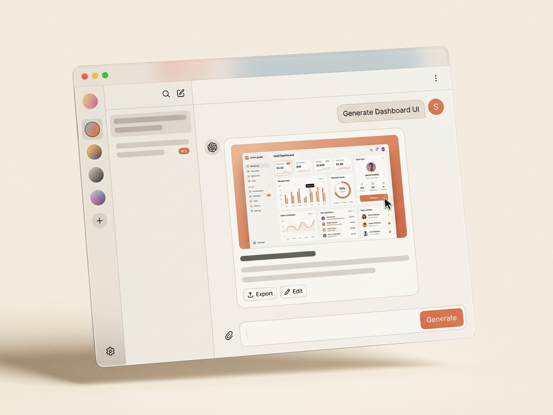
The best AI skills for SaaS dashboard design in 2026 generate component-library-aligned admin UIs - charts, tables, filters, settings, empty states - from a single product brief. They output ready-to-ship Tailwind, shadcn, or Figma files that match the visual bar set by Linear, Stripe, and Notion. No design retainer, no 6-week sprint, no "we'll fix the dashboard in v2."
B2B SaaS teams that ship a Linear-grade dashboard at launch see 3 - 5x higher week-2 retention than teams that ship a generic admin template. Dashboards are where users actually live - the marketing site sells the dream, the dashboard either keeps them or churns them.
This guide covers the five SaaS dashboard skills we recommend on Vibe Skills in 2026, the dashboard anatomy that scales, and how to ship a publish-ready admin UI in a day.
ស្វែងរកសមត្ថភាពដែលបានរៀបចំរាប់រយសម្រាប់ Claude, Cursor, និងច្រើនទៀត។
Why Dashboard Design Lags Behind the Marketing Site
Most B2B startups spend 80% of their design budget on the homepage and 20% on the product itself. That ratio is backwards. Visitors decide in 8 seconds whether to sign up. Users decide in 8 minutes whether to stay. The dashboard is the 8-minute test.
The three reasons SaaS dashboards ship ugly:
- Designers cost $120/hour and dashboards have hundreds of states. Empty state, loading state, error state, success state, mobile state, dark mode. A real dashboard needs 200+ screens. At agency rates, that is a $40,000 line item most pre-seed teams skip.
- Component libraries solve buttons, not flows. Tailwind UI, shadcn, and MUI ship beautiful components. They do not ship the dashboard layout, the chart hierarchy, the filter pattern, or the settings page. Founders end up Frankensteining 12 components into a layout that looks like a 2017 admin template.
- The "we'll fix it later" trap. Teams ship an ugly dashboard, raise a seed round, and then discover users churned at week 2 because the product looked like a side project. The fix costs 5x what shipping it right would have.
Linear, Stripe, and Notion did not win because their features are unique. They won because their dashboards feel premium. AI skills on Vibe Skills close that gap for everyone else - you get the Linear-grade output without the 2-year design hire.
ស្វែងរកសមត្ថភាពដែលបានរៀបចំរាប់រយសម្រាប់ Claude, Cursor, និងច្រើនទៀត។
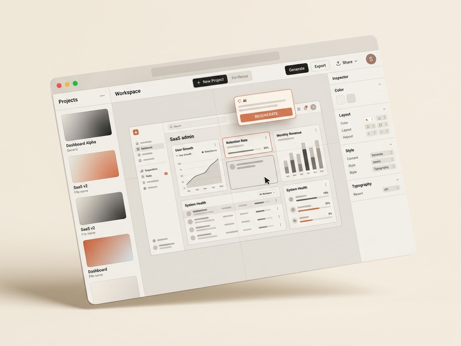
Dashboard Anatomy: The 6 Sections Every SaaS UI Needs
A converting SaaS dashboard follows a fixed 6-section blueprint: nav, header, KPI strip, charts, data table, settings. Each section has a job. Skip one and the dashboard feels broken; over-design one and the hierarchy collapses.
| Section | What it shows | Why it matters |
|---|---|---|
| 1. Sidebar nav | Logo, primary routes, workspace switcher, account | Anchors the user across every screen, signals product depth |
| 2. Page header | Page title, breadcrumbs, primary CTA, secondary actions | Tells the user where they are and what to do next |
| 3. KPI strip | 3 - 5 headline metrics with trend deltas | Front-loads the answer to "is my product working?" |
| 4. Charts | 1 - 2 main charts with filters and time range | Visualizes the trend behind the KPIs |
| 5. Data table | Sortable, filterable, paginated rows with row actions | The workhorse - 60% of dashboard time happens here |
| 6. Settings | Profile, team, billing, integrations, API keys | Where activation, expansion, and churn decisions happen |
This is the blueprint Linear, Stripe, and Notion all follow. Each section has a hundred design decisions inside it - chart color, table density, empty state copy, filter placement. AI dashboard skills bake those decisions in for you, so you ship a coherent system instead of 6 disconnected pages.
Browse SaaS dashboard skills on Vibe Skills →
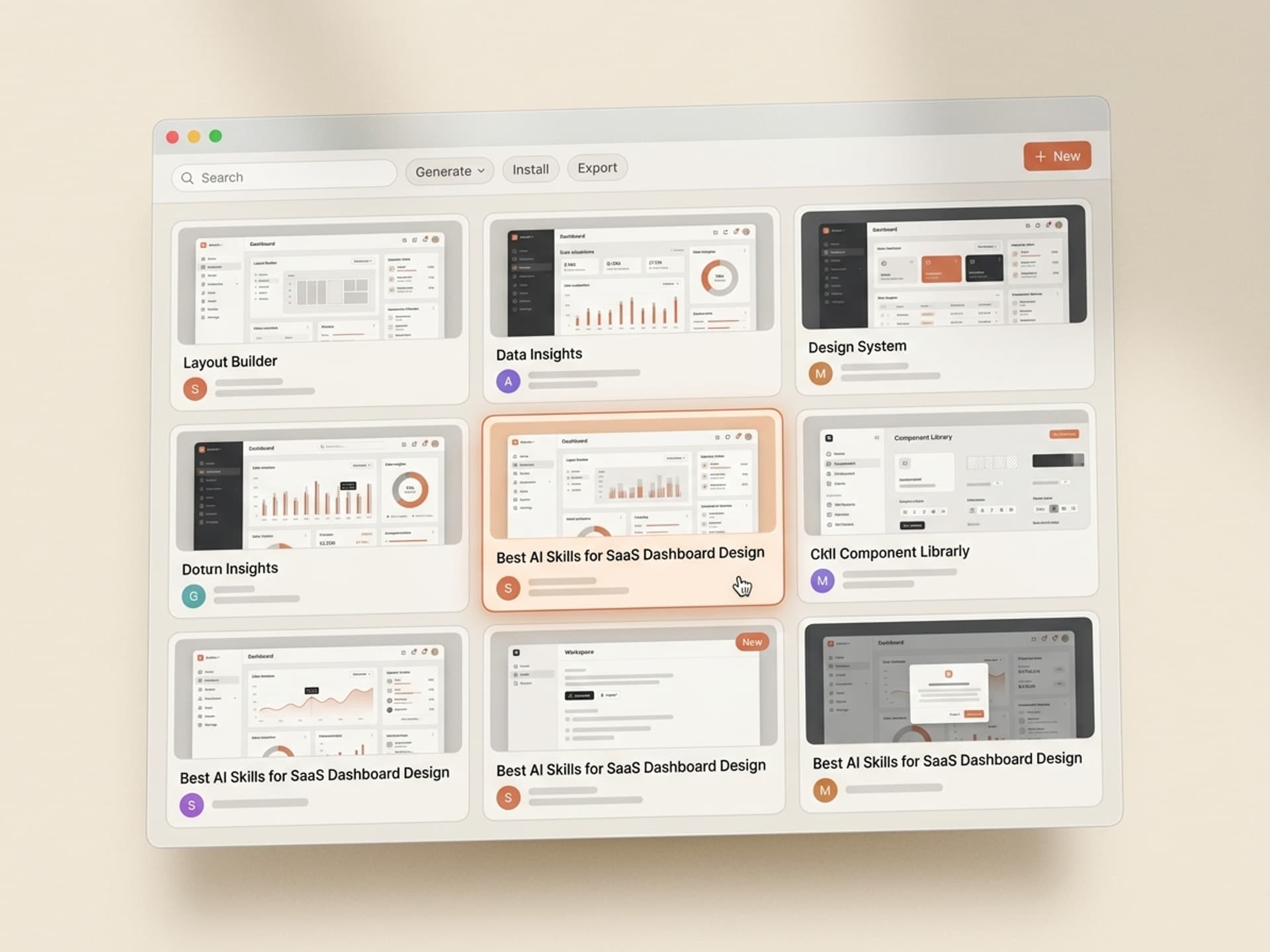
5 AI Dashboard Skills on Vibe Skills
These are the SaaS dashboard skills we recommend in 2026. All live in the Web & UI Design category on Vibe Skills.
1. SaaS Admin Dashboard Skill (shadcn + Tailwind)
Best for B2B SaaS pre-seed to Series A. Generates the full 6-section dashboard - sidebar, header, KPI strip, charts, data table, settings - in shadcn/ui + Tailwind CSS. Outputs a Next.js App Router project you can drop into your repo. Includes dark mode by default and ships with empty states, loading skeletons, and error boundaries. Linear-grade defaults.
2. Analytics Dashboard Skill (Charts + Filters)
Best for data-heavy products - analytics tools, BI dashboards, monitoring SaaS. Skill outputs a Recharts-based dashboard with line charts, bar charts, area charts, sparklines, and a custom date-range picker. Comes with 8 pre-built chart layouts (cohort retention, funnel, heatmap, time series). Plug in your data, ship the page.
3. Settings & Account Dashboard Skill
Best for founders who shipped the main product but never built settings. Generates the entire /settings route tree - Profile, Team Members (with invite flow), Billing, API Keys, Webhooks, Integrations, Notifications. shadcn-aligned, mobile-responsive. Most underrated skill in the category because settings is where 40% of churn risk lives.
4. Onboarding Dashboard Skill (Empty States + Checklist)
Best for new SaaS that needs day-1 activation. Generates the empty-state version of every dashboard page plus a 5-step onboarding checklist component (Linear-style). Includes welcome modals, tooltip tours, and progress indicators. Activation lives in the empty state - this skill stops you shipping a dashboard that screams "you have no data."
5. Admin Dashboard Skill (Internal Tools)
Best for internal admin panels - the dashboard your support team uses to look up users, refund payments, suspend accounts. MUI-based for density. Comes with user search, audit log table, impersonation flow, refund modal, and feature-flag toggle UI. Boring on purpose - high signal, no decoration.
Browse the full Web & UI Design category on Vibe Skills →
Over 30 skills per category. All included in a Vibe Skills subscription.
Build Your Dashboard in a Day Workflow
You can go from "we have no dashboard" to a Linear-grade UI in production in under 8 hours. Here is the workflow:
Step 1: Pick the right skill on Vibe Skills
Start at /category/web-ui and pick based on your product type:
- B2B SaaS, fresh build → SaaS Admin Dashboard Skill
- Analytics product → Analytics Dashboard Skill
- Already shipped, missing settings → Settings & Account Dashboard Skill
- New product, day-1 activation problem → Onboarding Dashboard Skill
- Internal team tool → Admin Dashboard Skill
Install the skill into your AI tool of choice - Claude, Cursor, or whatever you use to ship code.
Step 2: Brief the skill (10 minutes)
Every dashboard skill takes a 5-field brief: product name, primary user role, top 3 metrics, top 3 user actions, brand color. That is it. The skill turns those 5 fields into a full design system: typography, spacing scale, chart palette, dark mode tokens, empty-state illustrations.
Step 3: Generate the screens (90 minutes)
Run the skill. It outputs:
- 6 main page templates (overview, analytics, users, billing, settings, onboarding)
- 30+ component primitives (buttons, inputs, modals, dropdowns, tooltips, cards)
- Empty states, loading states, error states, success states
- Mobile-responsive breakpoints
- Dark mode tokens
Output is real code (Next.js + shadcn + Tailwind) or a Figma file, depending on the skill.
Step 4: Wire your data (3 hours)
Replace the mock data with your real Supabase or API calls. The skill outputs typed components, so plugging in real data is mechanical. Most teams ship the homepage of the dashboard the same afternoon they install the skill.
Step 5: QA and ship (2 hours)
Walk every page on mobile, every empty state, every error state. The skill ships these by default, but always check. Then deploy.
Total: 7 - 8 hours from install to production. Compare that to the typical "design sprint + 4 weeks of front-end work + QA pass" that takes 6 - 10 weeks at most agencies.
Frequently Asked Questions
Should I use Tailwind UI templates instead?
Tailwind UI is excellent for marketing pages. For dashboards it falls short - you get isolated components but no opinionated layout, no chart system, and no dark-mode-aware data table. The dashboard skills on Vibe Skills ship the full system, not the parts. You will still install Tailwind UI for marketing surfaces; you should not use it for the product itself.
shadcn vs MUI vs Chakra - which one wins for SaaS dashboards?
shadcn/ui is the default for new B2B SaaS in 2026 - it's owned code (you copy components into your repo), Tailwind-aligned, and ships dark mode out of the box. MUI is still strong for internal tools where density matters. Chakra has lost share to shadcn. The Vibe Skills dashboard skills lean shadcn for product UIs and MUI for internal admin panels. Pick the skill that matches the use case - never run two systems in one product.
Custom design vs AI-generated dashboard - what is the trade-off?
A custom design from a senior product designer ($120/hour, 6-week engagement) gets you a dashboard tuned to your specific user. An AI dashboard skill ($39/month subscription) gets you a Linear-grade dashboard in a day. For pre-seed to Series A, the AI skill wins on every axis - cost, speed, consistency. Past Series B, you hire a product designer to push past the templated baseline. Browse the Web & UI category on Vibe Skills to see the baseline you start from.
Will my dashboard look like every other AI-generated SaaS?
No - the skill takes your brand color, your product brief, and your 3 KPIs as input. Two products using the same skill end up looking different because the inputs are different. The structural decisions (sidebar pattern, table density, chart style) are shared, which is a feature, not a bug - that is what makes the output feel professional instead of homemade.
Can I edit the dashboard after the skill generates it?
Yes. Every Web & UI skill outputs real code (Next.js, shadcn, Tailwind) or a Figma file you fully own. Most teams use the skill output as the starting point and customize the empty states, the brand color, and the marketing-aligned details. The structural parts - sidebar, table, chart hierarchy - typically ship as-is.
How does this compare to using a $79 ThemeForest dashboard template?
ThemeForest dashboard templates are 5 years out of date, written in legacy jQuery + Bootstrap, and built for a generic "admin panel" use case. They do not match the visual bar set by Linear or Stripe. The dashboard skills on Vibe Skills are written in shadcn + Next.js + TypeScript, ship dark mode, and follow the 2026 design conventions. Same end result, completely different baseline.
Do I need a designer at all if I use a dashboard skill?
For pre-seed to Series A, no - the skill output is shippable. From Series A to Series B, you hire a part-time designer to push the brand voice. Past Series B, you hire a full-time product designer to differentiate from the AI baseline. The skill is the floor, not the ceiling - it gets you to the bar Linear set in 2024 so you can spend design hours on what makes you different.
The Punchline
Dashboards are the second most important surface in your SaaS - and the one most founders ship last and worst. AI dashboard skills on Vibe Skills close the gap between "we shipped an admin panel" and "our product feels like Linear." The cost is one subscription. The output is a real codebase you own. The time is one day, not six weeks.
Stop shipping the 2017 admin template. Ship the 2026 dashboard.
Browse SaaS dashboard skills on Vibe Skills →
Skip the 6-week design sprint. Install a dashboard skill on Vibe Skills and ship a Linear-grade SaaS UI in a day.